
The Carousel Controls tab lets you configure how your event layouts behave when using carousel-based presets (Carousel, Center Carousel, Multi Row Carousel, and Ticker). Options vary depending on the layout selected.
Carousel Control #
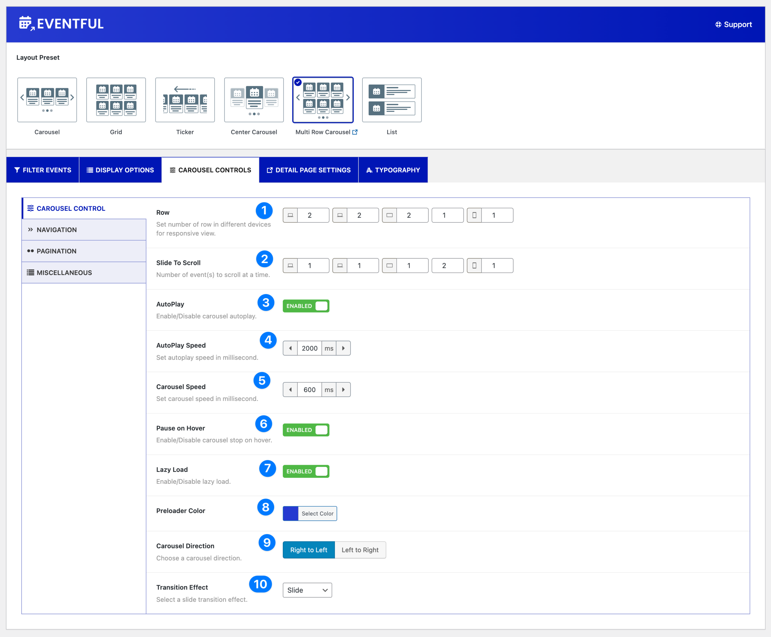
- Row: Set the number of rows for different devices. This option appears only when the Multi Row Carousel layout is selected.
- Slide to Scroll: Define how many event(s) move at a time during carousel scrolling.
- Autoplay: Enable or disable automatic carousel sliding.
- Autoplay Speed: Set the autoplay interval in milliseconds. (e.g.,
2000ms= 2 seconds) - Carousel Speed: Adjust the animation speed of the carousel in milliseconds.
- Pause on Hover: Enable or disable pausing when the user hovers over the carousel.
- Lazy Load: Enable or disable lazy loading for images, improving page performance.
- Preloader Color: Select a color for the preloader that appears while content loads.
- Carousel Direction: Choose the scroll direction:
- Right to Left (default)
- Left to Right
- Transition Effect: Select the animation effect for carousel slides. Available options:
- Slide
- Fade
- Colverflow
- Cube
- Flip
Navigation #
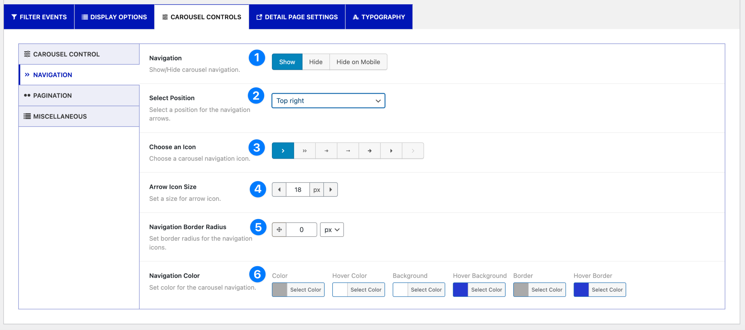
- Navigation: Show or hide carousel navigation arrows. You can also hide navigation only on mobile.
- Select Position: Choose where to display navigation arrows. Available positions:
- Top Right
- Top Center
- Top Left
- Bottom Left
- Bottom Center
- Bottom Right
- Vertically Center Outer
- Vertically Center Inner
- Vertically Center Inner (on Hover)
- Choose an Icon: Select an arrow icon style from the available options.
- Arrow Icon Size: Set the arrow size in pixels.
- Navigation Border Radius: Adjust the border radius of the navigation icons.
- Navigation Color: Customize navigation styles with:
- Color
- Hover Color
- Background
- Hover Background
- Border
- Hover Border
Pagination #
- Pagination: Enable or disable pagination. You can also choose to hide pagination on mobile.
- Pagination Type: Select the pagination style:
- Dots
- Numbers
- Pagination Color: Customize pagination appearance with the following options:
- Color
- Active Color (dots only)
- Background (numbers only)
- Hover Background (numbers only)
- Dynamic Pagination: Enable this option to update pagination dynamically based on carousel content.
Miscellaneous #
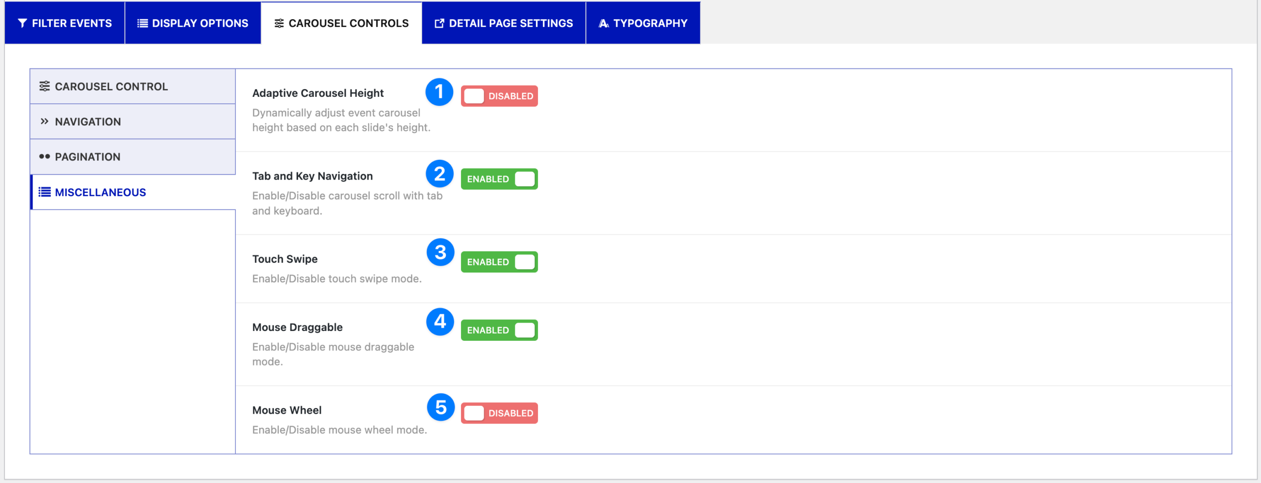
- Adaptive Carousel Height: Automatically adjust carousel height based on the tallest slide.
- Tab and Key Navigation: Enable carousel navigation with the tab key and keyboard arrows.
- Touch Swipe: Allow users to swipe through carousel slides on touch devices.
- Mouse Draggable: Enable dragging with a mouse to scroll through slides.
- Mouse Wheel: Enable scrolling through carousel slides using the mouse wheel.
Ticker Mode (special options) #
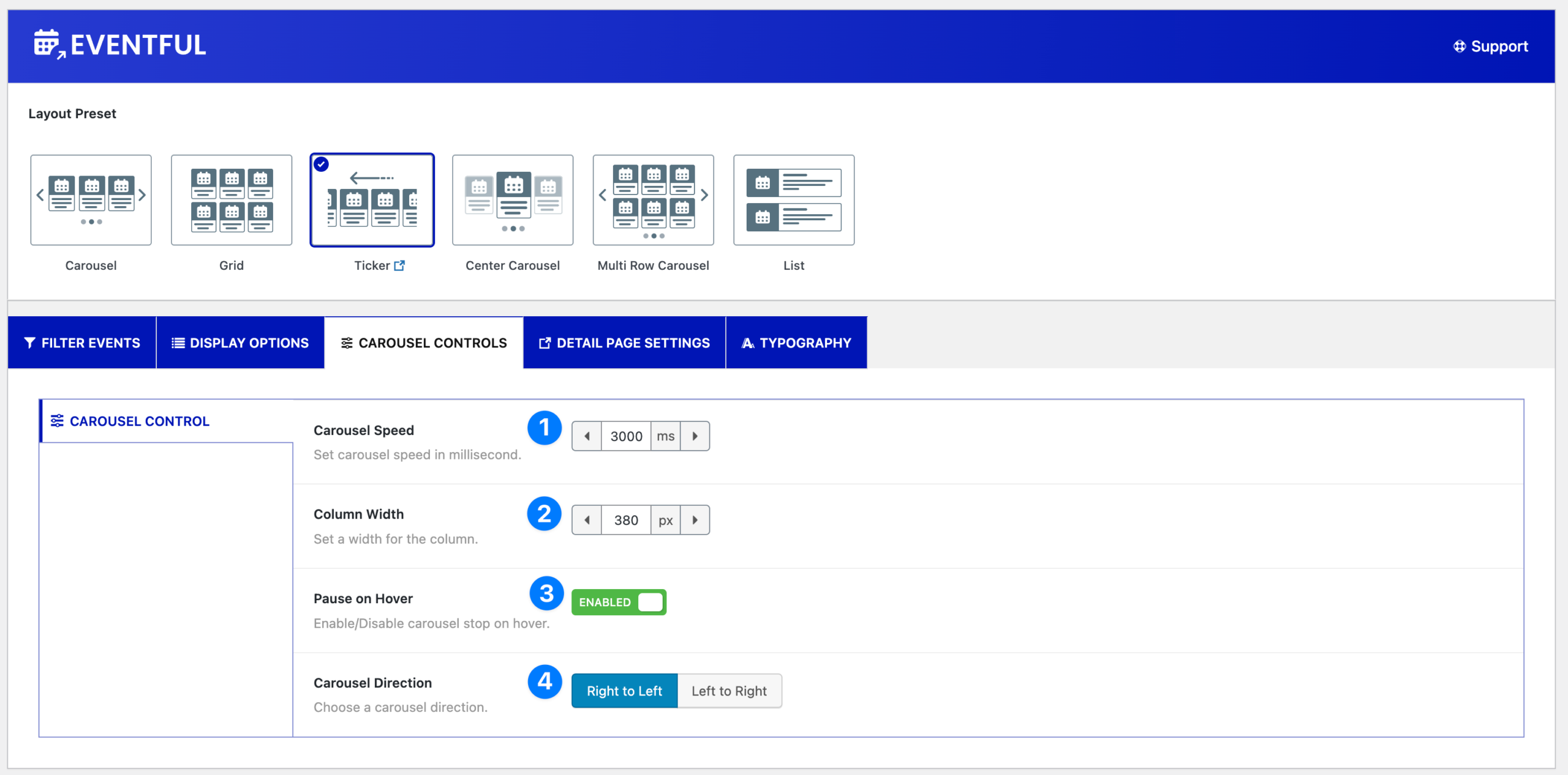
If you select the Ticker layout, additional options are available:
- Carousel Speed – Set ticker scrolling speed in milliseconds.
- Column Width – Define the width of each ticker item.
- Pause on Hover – Pause scrolling when hovering over the ticker.
- Carousel Direction – Choose ticker direction (Right to Left / Left to Right).


