

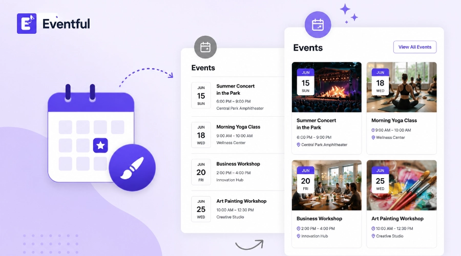

The Events Calendar is one of the most reliable ways to run an events section on WordPress. It just isn’t very pretty out of the box. If you’ve installed it, added a few events, and felt that letdown when the default list view showed up looking like a plain database dump, you’re not alone. Plenty of site owners search for how to make The Events Calendar look better within days of setup, once the initial relief of “it works” wears off and the design reality sets in.
This guide covers why the default styling looks the way it does, what actually moves the needle visually, and where a no-code layout tool fits if you’d rather not hand-edit CSS.
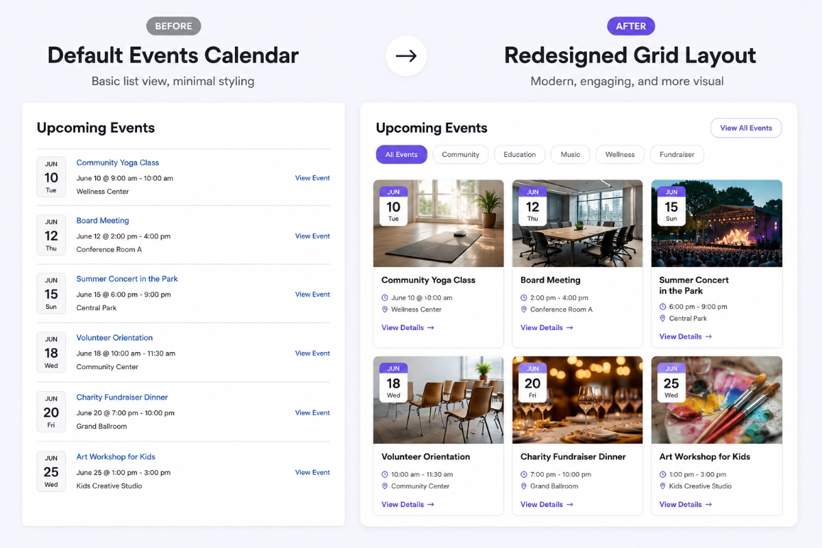
Key Takeaways
- Default Events Calendar styling borrows from your theme’s generic list and typography rules instead of a purpose-built event design, which is why it can look flat no matter how nice your theme is elsewhere.
- The fastest wins are typography, spacing, and event card layout, not a full redesign.
- No-code tools can swap the layout to a grid, slider, carousel, or timeline without touching a stylesheet.
- Archive, category, tag, and related-events pages usually get skipped during a redesign, even though visitors land on them constantly.
- A layout tool won’t fix messy event data. It just presents whatever content you give it more clearly.
Table of Contents
Why The Events Calendar Looks Basic by Default
The Events Calendar runs on 700,000+ active WordPress installs (WordPress.org plugin directory, retrieved 2026-07-06), and that scale is part of the problem. A plugin built to work reasonably well across that many different themes can’t bake in one specific look. Its templates borrow list styles, spacing, and typography from whatever theme happens to be active, and most themes were never designed with an events list in mind.
That’s why the same plugin can look clean on one theme and cramped on another. It isn’t broken. It’s deliberately neutral, and neutral rarely looks finished. The free version also gives you list, month, and day views, but very few controls over card layout, image size, or spacing between events. Real customization has traditionally meant custom CSS, a child theme, or a dedicated add-on, which is exactly the barrier most non-technical site owners run into when they decide to make The Events Calendar look better.
How to Make The Events Calendar Look Better Without Code
Improving the design without code means thinking about layout as a set of choices, not a stylesheet. Instead of asking “what CSS rule controls this padding,” ask “what layout, spacing, and color options does this tool expose in its settings panel.” Modern block editors, page builders, and events-specific add-ons all expose these controls visually now.
So where do you actually start if PHP and CSS are off the table? Start with what visitors notice first: layout and typography. Spacing and color come next, since they’re quick wins inside almost any settings panel. Event cards, archive pages, and taxonomy pages usually need the most attention, because The Events Calendar’s default templates treat them as an afterthought.
What to Actually Improve, Section by Section
Layout
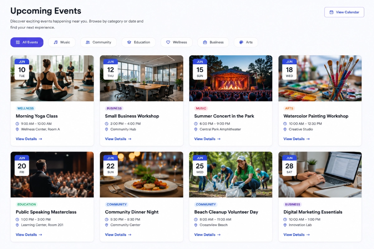
Grid layouts read faster than a plain list, especially once you have more than eight or ten upcoming events. A list forces visitors to scan line by line. A grid, carousel, or slider groups events visually so people can compare dates and locations at a glance. Density matters too. Cramming ten cards into one row looks busy; four to six per row usually reads cleaner on desktop.
Typography
Default Events Calendar typography usually just inherits your theme’s body font and size, with no real hierarchy between event titles, dates, and venue names. Increasing the title size relative to the metadata, and settling on one font for headings and one for body text, makes a page easier to scan in under a second.
Spacing
Tight spacing is one of the fastest ways to make an events list feel cramped. Adding breathing room between cards, plus consistent padding inside each card, does more for perceived quality than almost any other single change. Whitespace isn’t empty space. It’s what lets the important details stand out.
Colors
Default event pages often clash with brand colors, since The Events Calendar’s styling was never meant to match a specific palette. Matching accent colors, buttons, and category tags to your brand makes the calendar feel like part of the site instead of a bolted-on plugin. Keep contrast high enough that dates and calls to action stay readable, especially for older visitors and anyone using assistive tech.
Event Cards
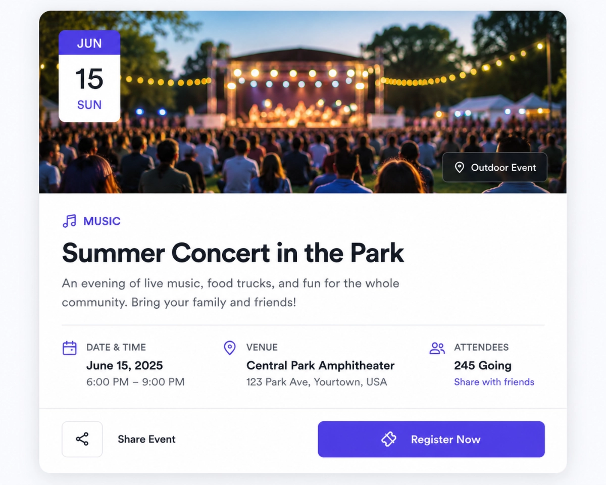
A card with a small thumbnail, a tiny date, and no clear call to action asks a lot of a visitor’s attention. A larger featured image, a clear date and time treatment, a one-line venue detail, and a visible button (Register, Learn More, Get Tickets) all reduce the guesswork. Hover states matter too. They tell visitors a card is clickable before they click it.
Archive Pages
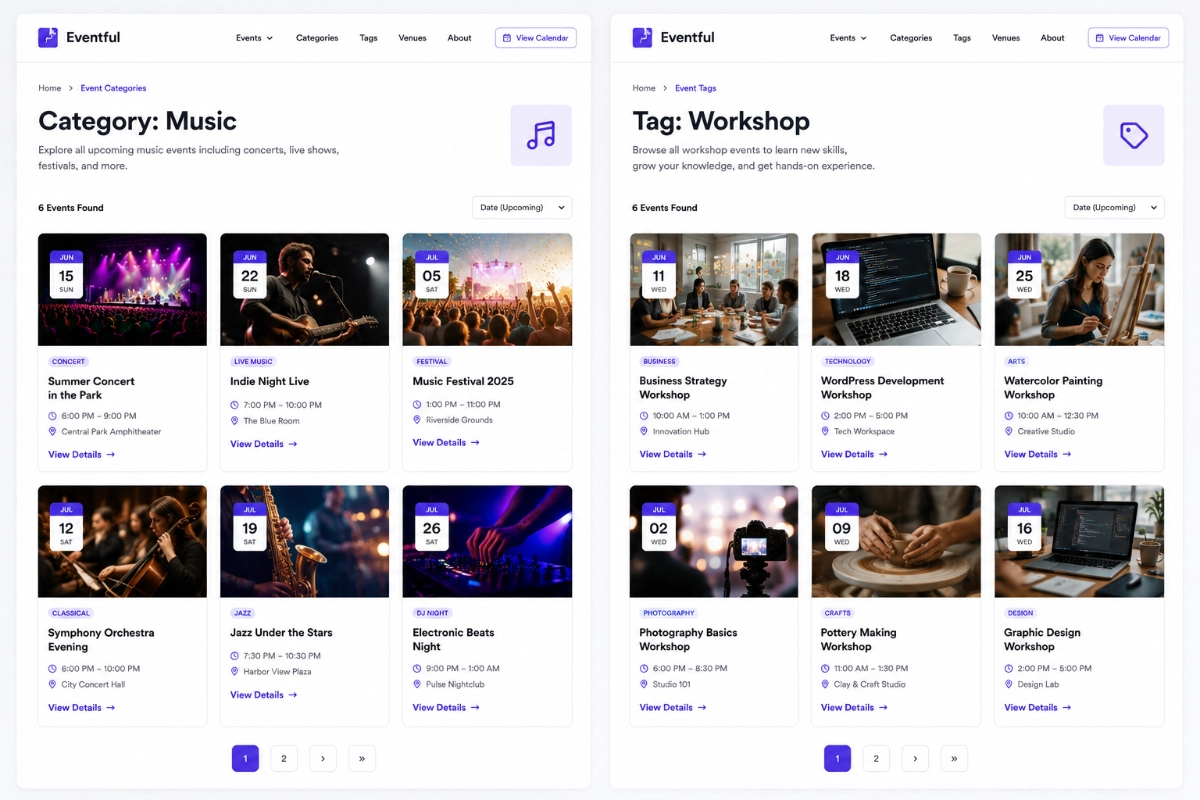
The main events archive is usually the first page most visitors land on, yet it’s one of the least customized by default. Fixing it usually means switching from a plain list to a grid or slider, then applying the same typography and spacing changes used on individual event cards.
Category Pages
Category pages inherit whatever styling the archive page uses, which means an archive fix should carry through automatically if you’re using a layout tool that applies settings globally. Customize categories manually instead, and it’s easy to end up with inconsistent designs across categories over time.
Tag Pages
Tag pages get the least attention of any Events Calendar page type, mostly because fewer visitors land there directly. They still deserve the same basic layout consistency, since search engines and returning visitors do reach them, particularly for recurring event series.
Related Events
A “related events” or “you might also like” section keeps visitors browsing instead of leaving after one event page. It only helps if the related cards look consistent with the rest of the site, using the same card design, spacing, and typography as the main archive.
How Eventful Helps as a No-Code Solution
This is the gap the Eventful add-on was built to close. It gives The Events Calendar new layout options, including a slider, carousel, grid, minimal list, and vertical timeline, plus a filter bar for category, tag, venue, organizer, and date. You can see the full breakdown on The Events Calendar layout options page, all configured through settings panels instead of custom code.
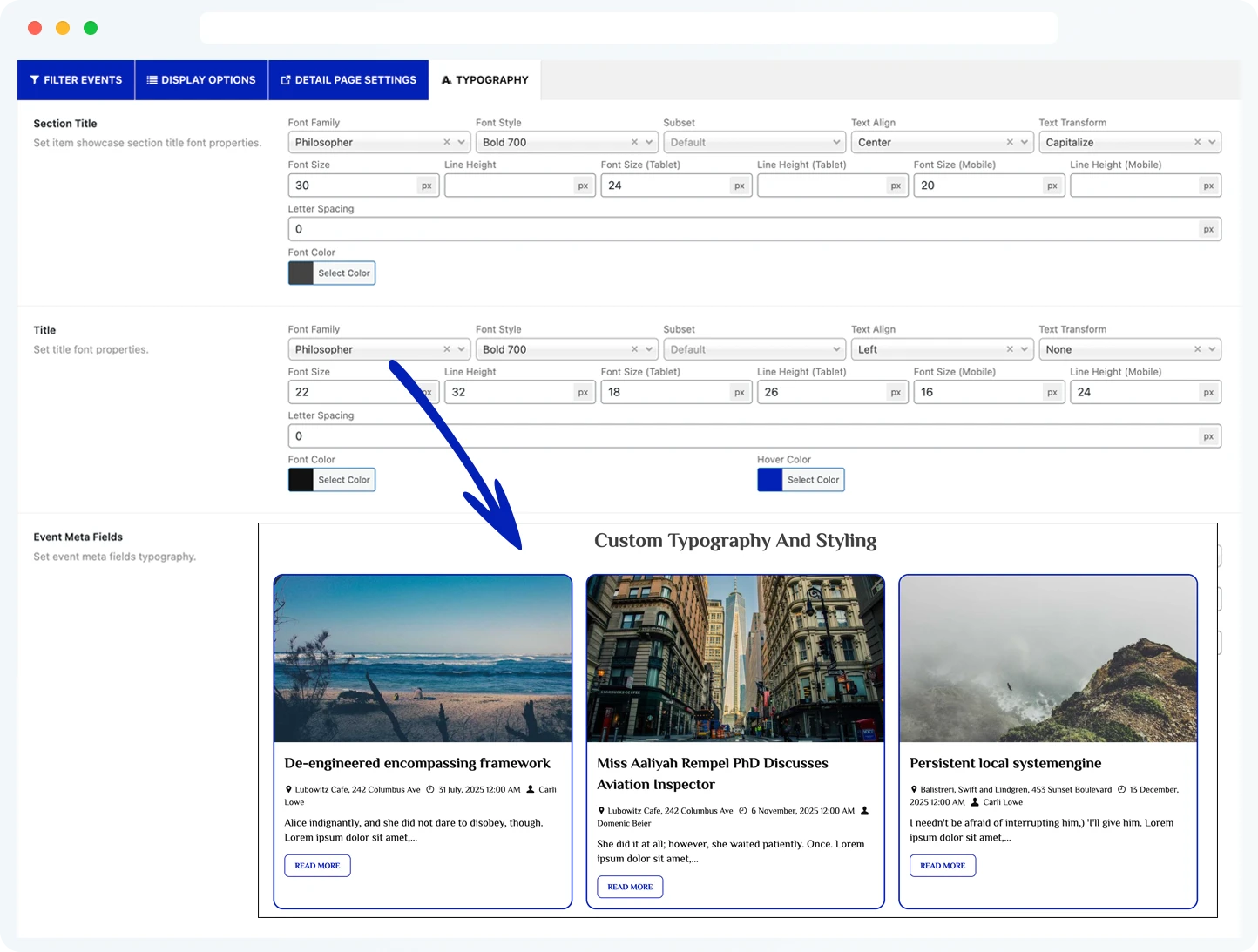
Typography and color come from the same settings screen. Pick fonts from the built-in Google Fonts library, set a global color scheme, and adjust spacing and columns without opening a stylesheet. It won’t write your event descriptions or pick better photos for you. What it does is take whatever content you already have in The Events Calendar and present it with real hierarchy, spacing, and a layout that matches the rest of your site.
If you want to see whether it fits your setup before committing to anything, the free version of Eventful on WordPress.org covers the core layouts and is a reasonable way to test the no-code approach on a live site first.
Suggested post: How to Display Events in WordPress Without Coding
Who This Is Best For (and Who It Isn’t)
This approach fits site owners who already use The Events Calendar, like how it functions, and just want to make The Events Calendar look better without hiring a developer. It also fits agencies managing several client sites that need consistent event styling without writing custom CSS for each one.
It’s a weaker fit if you need a completely custom, one-off design that no settings panel can produce, or if your event data itself is messy. No layout tool fixes missing images, vague titles, or incomplete venue details. In that case, cleaning up the underlying event data will do more for your page than any layout change.
Common Mistakes to Avoid
A few patterns show up again and again on Events Calendar redesigns, no-code or not.
- Changing colors and fonts without fixing spacing first, which leaves the page busy instead of just prettier.
- Redesigning the archive page but leaving category and tag pages on the old default styling.
- Adding a slider or carousel with too many events visible at once, recreating the same cramped feeling as a list.
- Skipping the call-to-action button on event cards, so visitors aren’t sure what to do next.
- Assuming a layout tool will fix low-quality event photos or missing details on its own.
Frequently Asked Questions
Do I need to know CSS to redesign The Events Calendar?
No, not for most changes. Layout, spacing, typography, and color changes can be made through The Events Calendar’s own settings or a dedicated add-on, entirely through visual settings panels. CSS is really only necessary for highly specific, one-off customizations.
Will changing the layout break my existing events?
No. Layout tools built for The Events Calendar read your existing event data, titles, dates, venues, and images, then display it differently. They don’t alter or delete the underlying event content itself.
What’s the fastest way to make The Events Calendar look better?
Start with spacing and typography before colors or layout changes. Adding breathing room between cards and creating clear text hierarchy usually improves the perceived design more than any other single change, often in minutes with the right settings panel.
Does the archive page need separate styling from category and tag pages?
Not if you use a layout tool that applies settings globally. Category and tag pages inherit the archive page’s styling automatically in that case, though manual CSS customizations usually need to be repeated on each page type separately.
Is there a free way to try a no-code Events Calendar redesign?
Yes. The free version of Eventful on WordPress.org includes core layout options like grid and list views, enough to test whether a no-code approach works for your site before considering a paid upgrade.
Final Thoughts
Making The Events Calendar look better doesn’t require a developer or a redesign from scratch. Typography, spacing, and card layout fix most of what makes the default styling feel plain, and a no-code add-on can apply those changes across your archive, category, and tag pages at once. If you want to see it on your own events before deciding anything, the free version of Eventful on WordPress.org is a low-risk place to start.